Highlight
Art Preview App
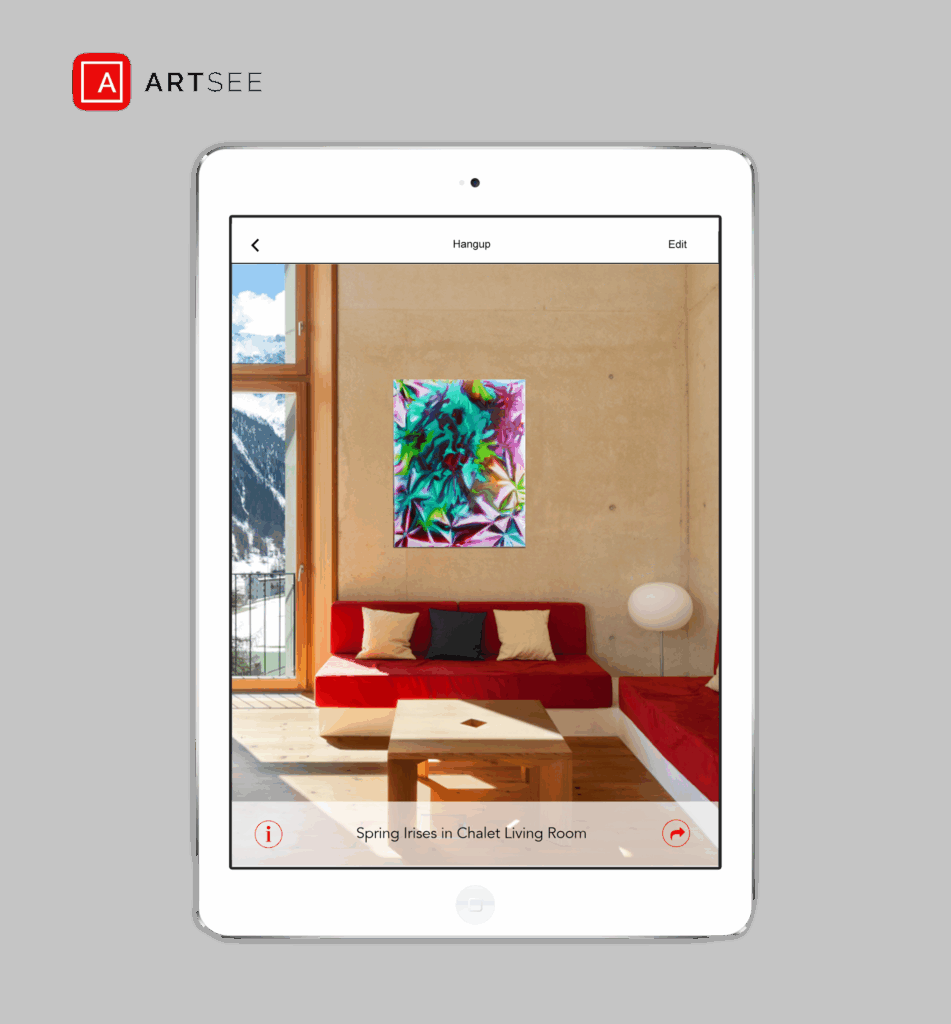
ArtSee is an iOS application designed to help users visualize artwork within their own environments before purchase. By combining artwork discovery, collection management, and contextual visualization, the app bridges the gap between viewing art in a gallery and understanding how it will look in a real-world space.
The problem
Purchasing art often requires buyers to imagine how a piece will look within a specific room, creating uncertainty and slowing decision-making. Traditional methods provide little support for comparing, organizing, or visualizing artwork within a personal space.
Goals, Needs and Pain Points: The user’s primary goal is to confidently select and visualize artwork that fits seamlessly within specific spaces, whether for personal use or client projects. They need an intuitive, aesthetically clean tool that allows them to preview art in context, quickly access information about pieces, and organize favorites for future reference. Pain points include the challenge of imagining how artwork will look in a real environment, the inefficiency of traditional methods for tracking and comparing pieces, and the lack of a streamlined system to support decision-making during gallery visits.
Solution
Empower users to:
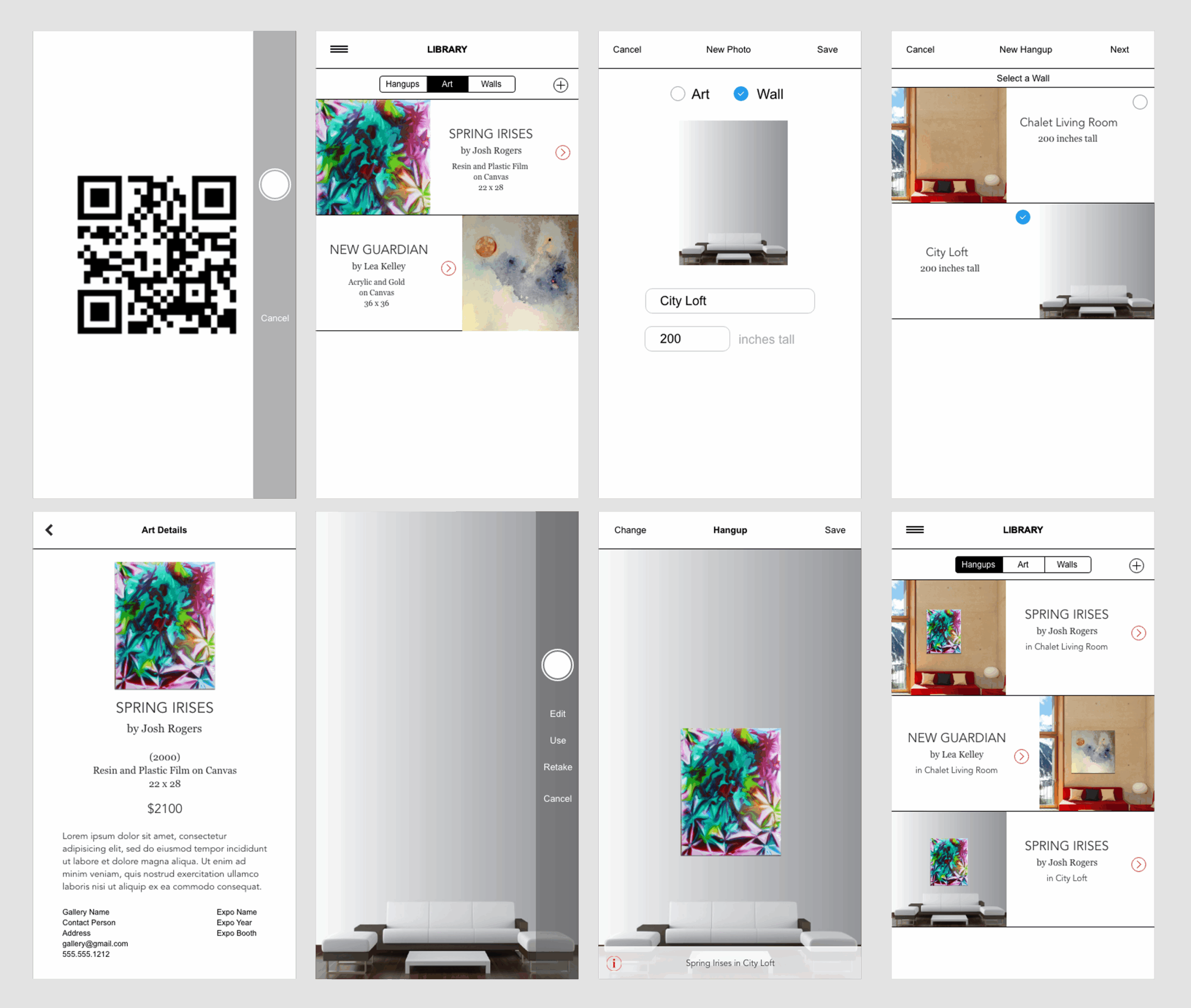
- Scan Artwork: Utilize image recognition to instantly access information about scanned pieces, replacing traditional placards or QR codes.
- Build a Personal Collection: Favorite artworks and compile a personalized collection, complete with notes and tags for future reference.
- Preview in Context: Upload photos of personal spaces to virtually place and view selected art, adjusting positioning to see how it would appear on their own walls.
These features are designed to enhance the art selection process, making it more interactive and tailored to individual preferences.
My role
In creation of ArtSee, my responsibilities encompassed:
- Conducting discovery, requirements gathering, and user needs analysis.
- Creating wireframes, workflows, and interaction concepts focused on simplicity and usability.
- Designing high-fidelity mobile experiences and established visual standards to guide implementation.
- Collaborating throughout the design process to align user needs, business goals, and technical feasibility.
Results & Impact
ArtSee exemplifies a strong commitment to user-centric design and visual storytelling within a mobile application. By facilitating a seamless connection between users and artworks, it enhances the art purchasing experience.
Key design elements include:
- Minimalist UI: A clean interface that emphasizes the artwork itself, avoiding unnecessary distractions.
- Neutral Color Palette: Utilized to frame the art without clashing, allowing the artwork to remain the focal point.
- Card-Based Design: Implemented for modular and easily scannable content presentation.
- Custom Icons: Designed to facilitate intuitive navigation and contribute to a refined aesthetic.
Typography, iconography, and spacing were meticulously chosen to replicate the ambiance of a modern gallery—open, calm, and deliberate. This approach ensures that the art remains at the forefront, providing users with a serene and focused browsing experience.